StoryBuilder
Helping novelists find time to develop their book ideas.
Solo Student Project
10 Weeks Part-time
Roles: UX Researcher, UX Designer, UX Writer
The Challenge
For many writers, becoming a published author is a lifelong dream. A dream that takes years of effort to realize. Even when authors have mastered their craft, they must still carve out time in their busy lives to efficiently develop, write, revise, and sell their next story.
My interest in this project was driven by a recent survey of independent authors. The survey results drove home how challenging the writer’s life can be. According to the survey, key factors in author success are the ability to be productive and prolific. I wanted to explore the idea of a digital tool that would aid authors in working more efficiently in pursuit of these goals.
Through further research, I was able to refine this idea to identify author pain points and land on a solution that would fill a hole in the current market and with the potential to improve author productivity.
I set out to design a mobile first app focused on the development phase of writing, allowing authors to work on their story ideas on the go: waiting in a doctor’s office, waiting to pick-up children after school, or on a break from their regular nine to five job.

Discover
To understand and empathize…research
Desk Research
During the research phase of this project, I took a deep dive in to existing information available from professional writing organizations. I was able to learn some solid facts about writing as a career. First, typical author income, either annualized or per book, is low. Second, the most common strategy to increase author income is to write, publish, and sell more books.
$12,749
median income
of independent authors
$1,000-10,000
per book in
traditional publishing
10 – 30 books published
over half >10 books,
and 20% > 30 books
Competitive Analysis
Next, I tackled a look-around to see what products where already on the market. When I reviewed common tools for writers, such as Scrivner, Dabble, and Ulysses; I found most of them focused on writing and on desktop computing. Plottr was the exception. It focuses on plotting the story but offers very limited performance on mobile devices.
At this point the research was leading me to focus on the planning stages of writing and on mobile first for the best market fit. This strategy was supported by the user interviews that followed.
User Interviews
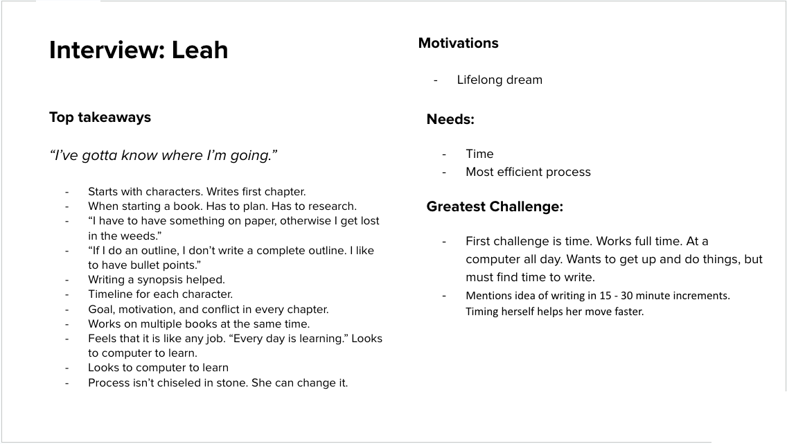
Finally, I recruited five published authors through a local professional writers’ organization for user interviews. Interviews were conducted with the aid of a discussion guide that focused on open-ended questions. Sessions were either in-person or over Zoom and most were recorded.
5
Published Authors
1 – 33
Books Published
2
Full-time Writers
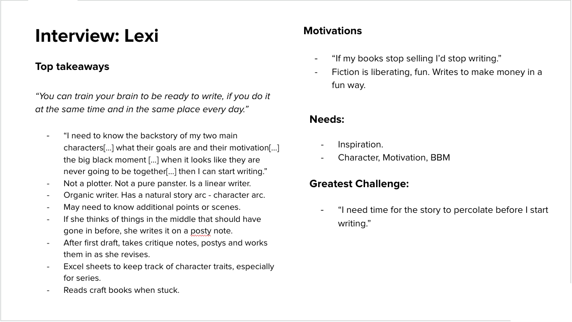
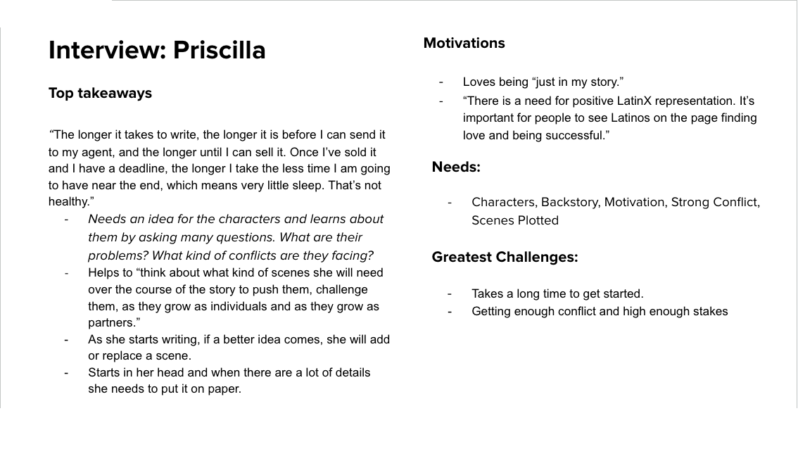
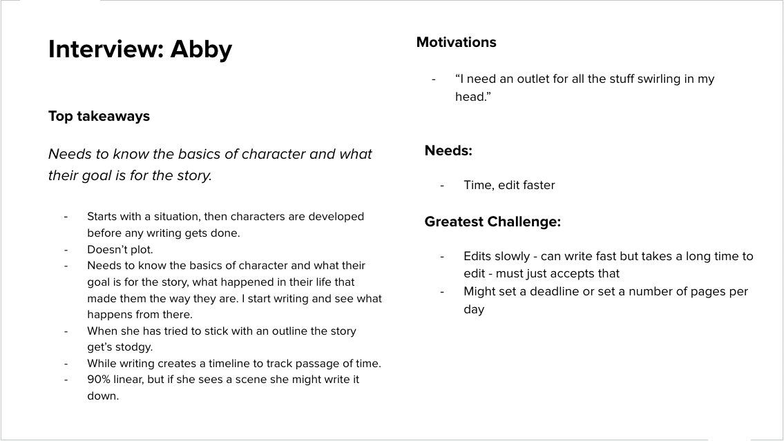
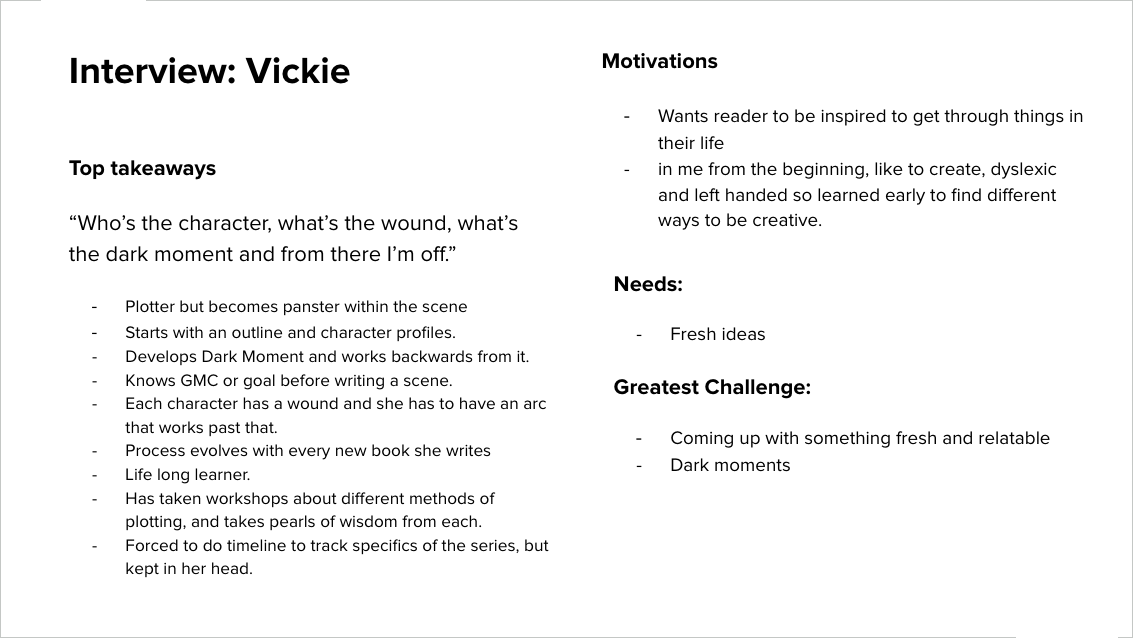
Interview Summaries:
Synthesis
To define goals for the project…study and sort the data
Affinity Mapping
Interviews yielded tons of data! I used affinity mapping to synthesize the data into top author needs and top story elements to better understand the story development process.
Affinity Map:
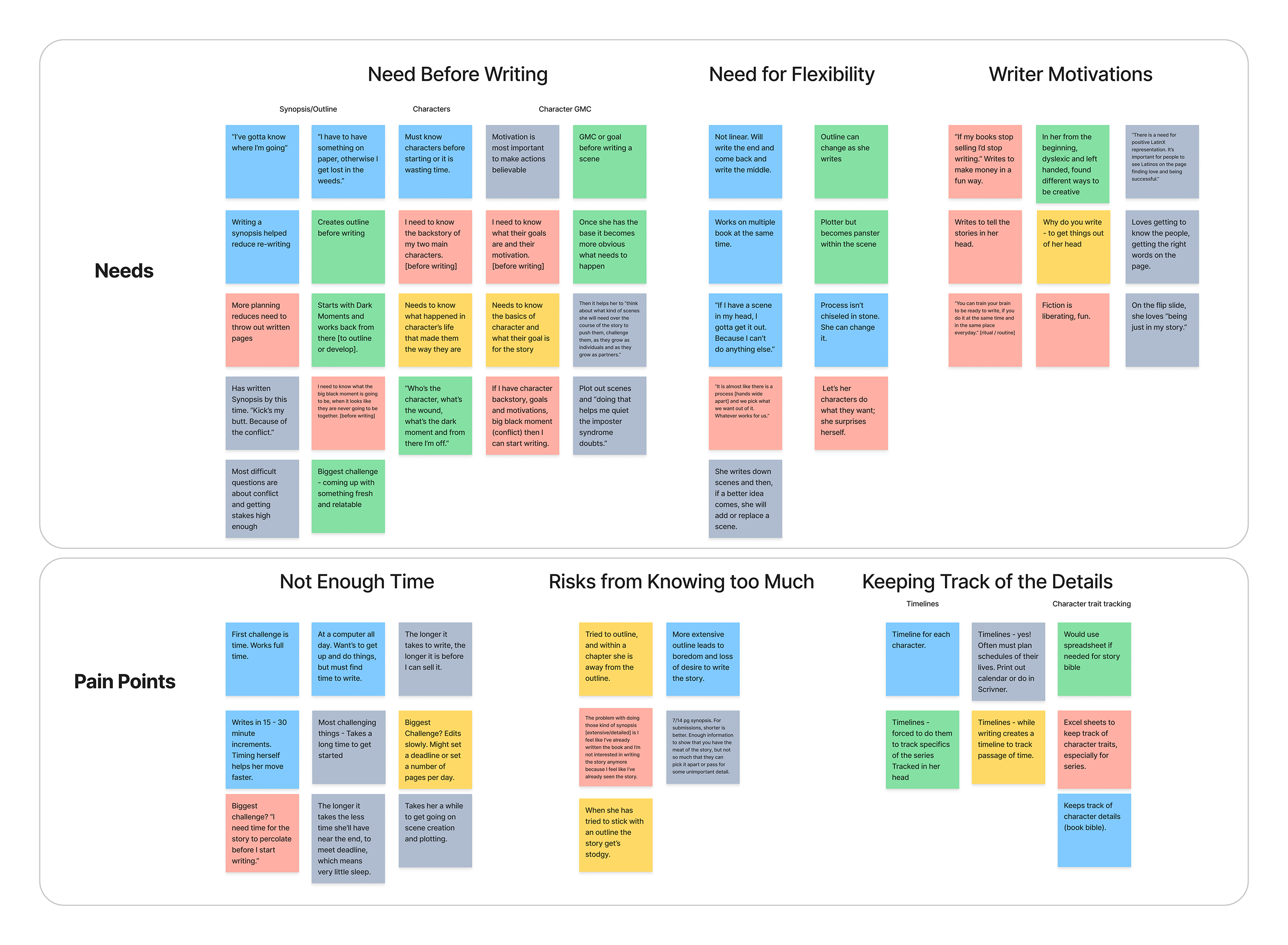
Author Pain Points and Needs:
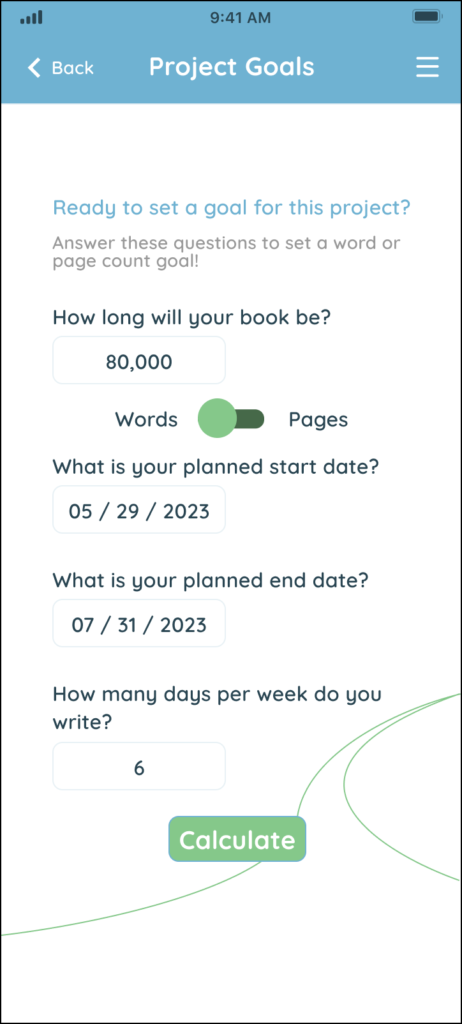
- Authors are pressed for time. Many authors work a “day job” in addition to writing or have to take time away from family to write. Time taken to develop the story and time spent writing both tie directly to how prolific they can be and being prolific is tied to profitability. So, authors need to make more time for both these activities but doing the prep work on the go in small time increments could increase author productivity.
- Flexibility is a second key need. While authors have many commonalities in how a story is put together, the order they tackle different tasks varies. Developing a story does not always follow a linear process. Being able to pick which element to work on when ideas are flowing is key.
- Authors all spoke about a “risk” from knowing too much. Certain tasks like producing an outline can dampen creativity for some authors, so there is a need to be able to skip some processes altogether.
- Finally, authors need assistance with keeping track of the details of their story. There are many elements and details that make up the story. Continuity is critical to keeping the reader engaged.
Personas
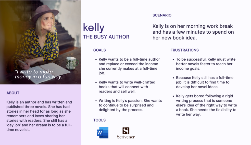
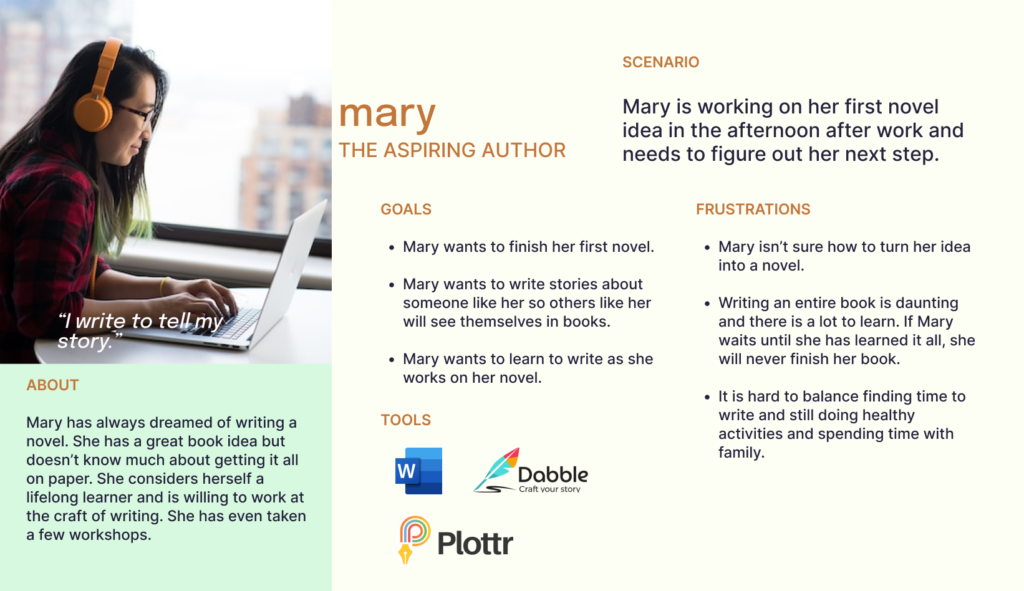
With the large amount of data I collected, I decided it would be worthwhile to go through the exercise of creating a primary and secondary persona to guide the app design.
Personas:
Develop
To develop and refine an idea…ideate
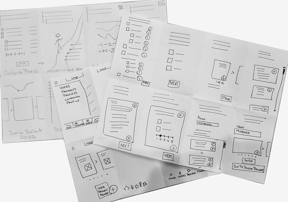
Sketches
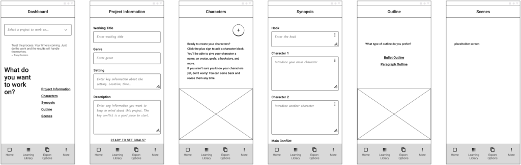
I began the development phase of the project by creating rough sketches to explore possible feature designs and layouts. I quickly discovered that for such a data entry intense app the best designs would be ones that were clean and minimalistic.
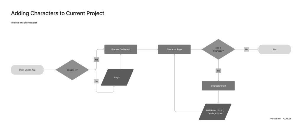
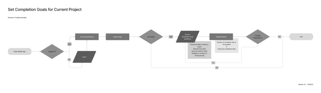
User Task Flows
Creating task flows helped me see that most tasks to be included in the app could be linear within the task and independent from other tasks. This would allow users to follow their own natural flow and also pick up and stop working easily.
Sample Task Flows:
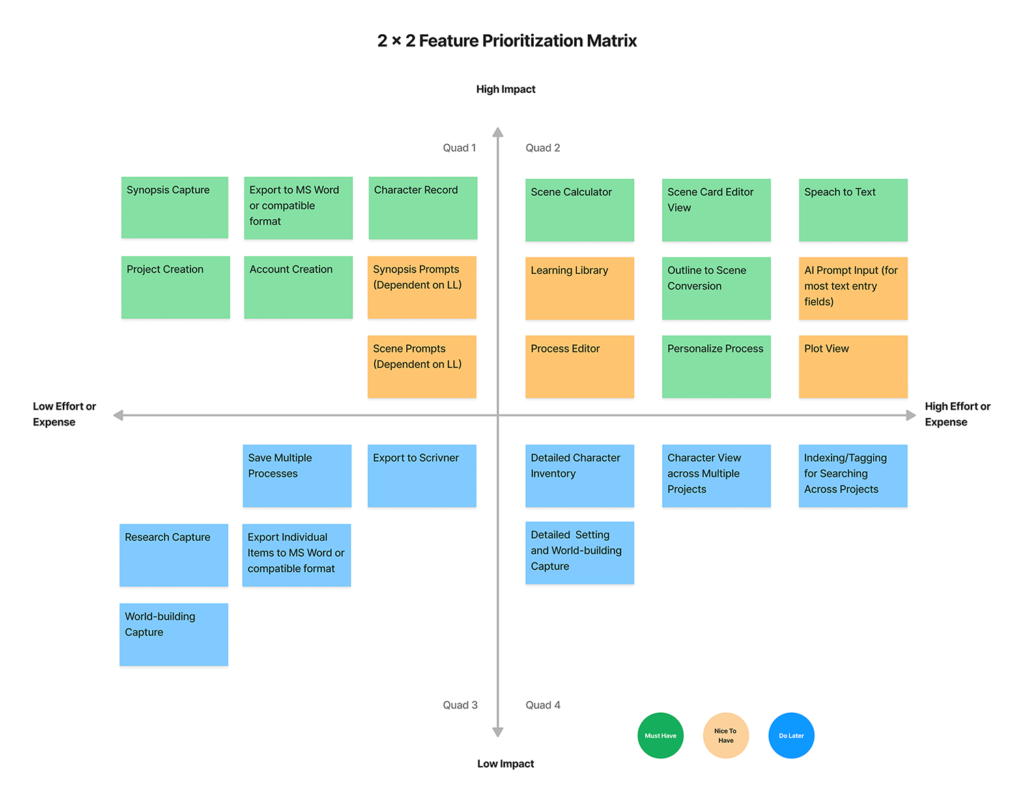
Feature Prioritization
To determine the scope of the initial MVP designs, I combined a 2 x 2 feature chart and the MoSCow method.
Matrix:
Prototype & Testing
Eager to see how the app was coming together, I quickly put together wireframes in a low-fidelity prototype for an initial round of moderated usability testing. Next, I used a higher fidelity prototype for two additional rounds of usability testing: unmoderated testing with Maze.co and another round of moderated testing with different users. Mostly, things went pretty well, but as always there were lessons to learn.
3
Rounds of Usability Testing
1 8
Total Participants
Take aways:
- I needed to prioritize key navigation elements and meet user expectations for position and icon of main navigation
- For the MVP, it would be more effective to combine the functionality of selecting and sorting scenes
- Removing bottom navigation and providing scroll indicators for longer screens could make the app feel more like a familiar notebook
- Positive responses to features like quotes and field prompts suggested tone was on point
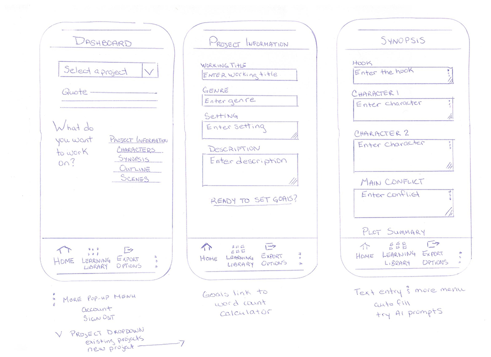
Sample Wireframes:
Deliver
Delivery is all about…implementation
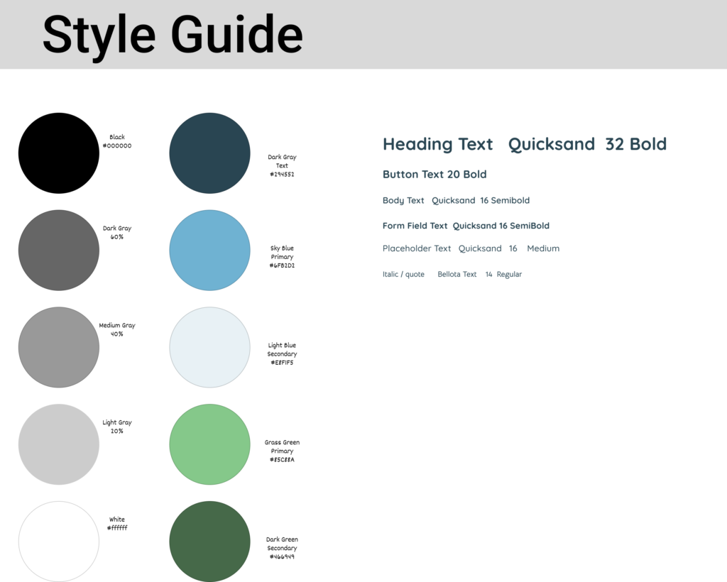
As this was a student UX project, my goal for the project was a mid-fidelity prototype. So, I limited my time on visuals by sticking to a very minimal style guide and using a combination of existing and new iconography.
Style Guide
My key goals visually were to: create a light, calm mood; use genre neutral colors; and make text easy to read since there was going to be a lot of it.
Simple Style Guide:
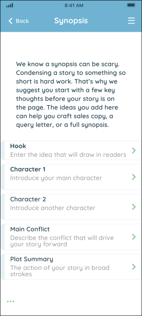
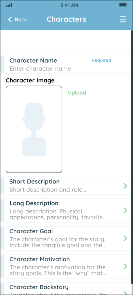
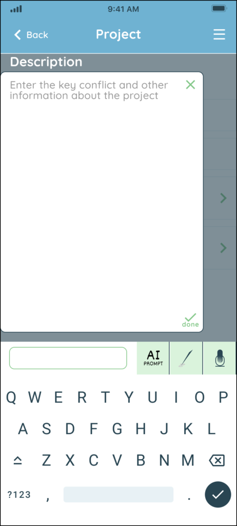
UX Writing
From the beginning, I knew content would be critical in an app for writers. I listened carefully to user interviews with an ear toward their language and vibe. This helped me identify accurate categories for tasks, as well as the right text to use for navigation, buttons, and other microcopy. I also decided early on to use longer field prompts to draw users into details pages. Finally, I added longer form content using a friendly, human, and encouraging tone.
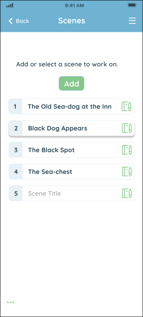
Sample Mid-Fidelity Comps:
Mid-Fidelity Prototypes
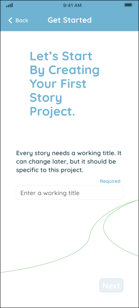
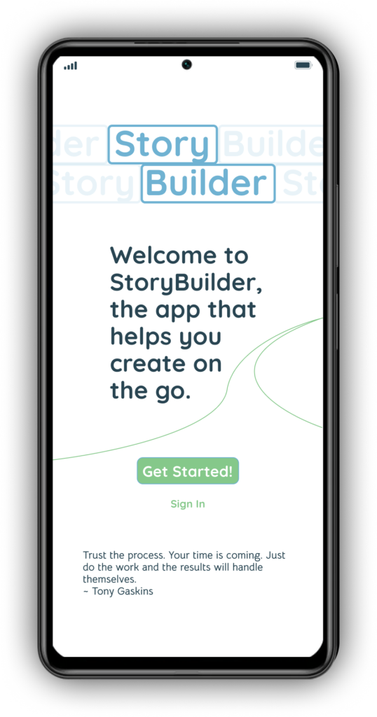
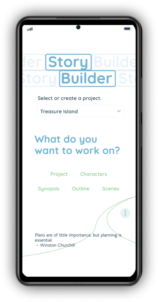
After creating a full set of comps for the app, I created two Figma prototypes, one for the onboarding flow and another for ongoing use.
Onboarding Prototype
Ongoing Use Prototype
My Design Tools
Figma and FigJam
Attributions
Some images and icons were added using the following Figma plugins and resources:
Icons from Streamline, Licensed under Community Free Resource License
“Kelly” Photo by Darius Basharon on Unsplash
“Mary” Photo by Christina @ wocintechchat.com on Unsplash
Low Fidelity Wireframes created using Mobile Wireframe UI Kit Licensed under CC BY 4.0